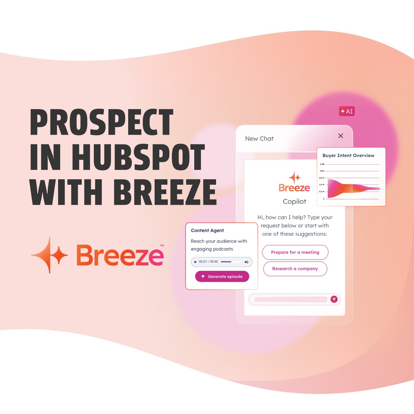
Since its unveiling at Inbound 2024, HubSpot’s Breeze AI has rapidly become a game-changer,...
March 13, 2025
Since its unveiling at Inbound 2024, HubSpot’s Breeze AI has rapidly become a game-changer, transforming how HubSpot users approach everything from...
Since its unveiling at Inbound 2024, HubSpot’s Breeze AI has rapidly become a game-changer,...
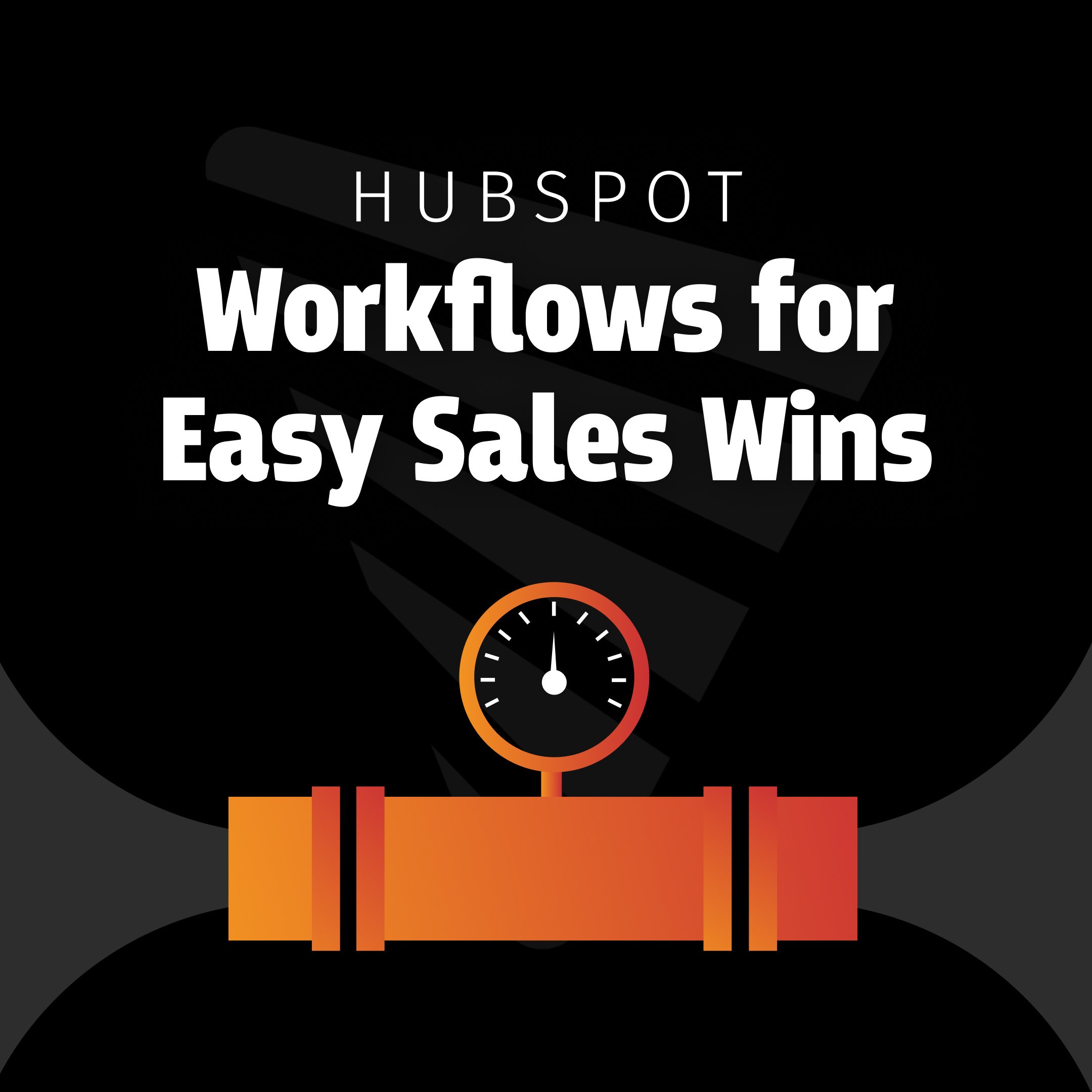
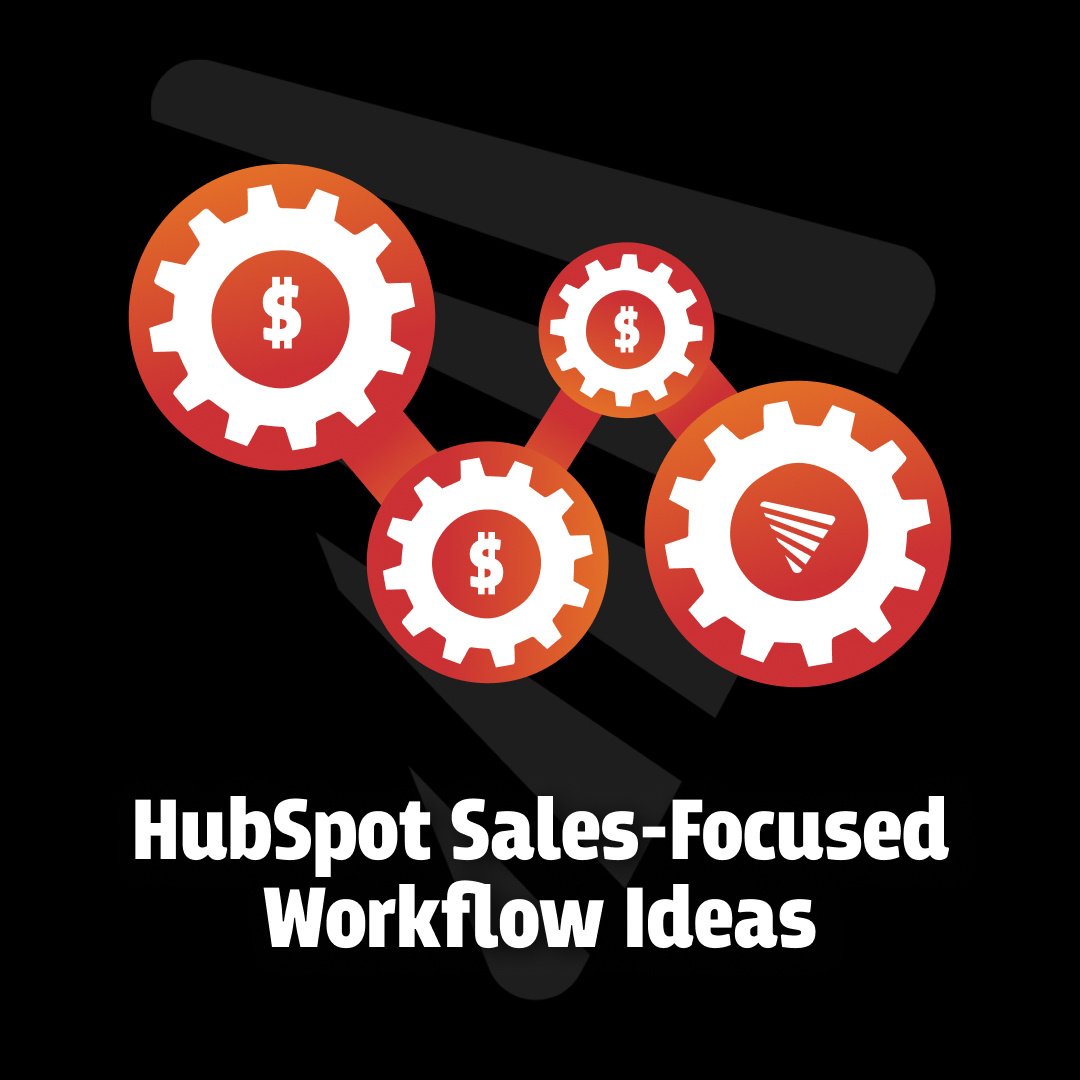
Sales and revenue are hard to generate. Those of us involved in business at any level know this. We...
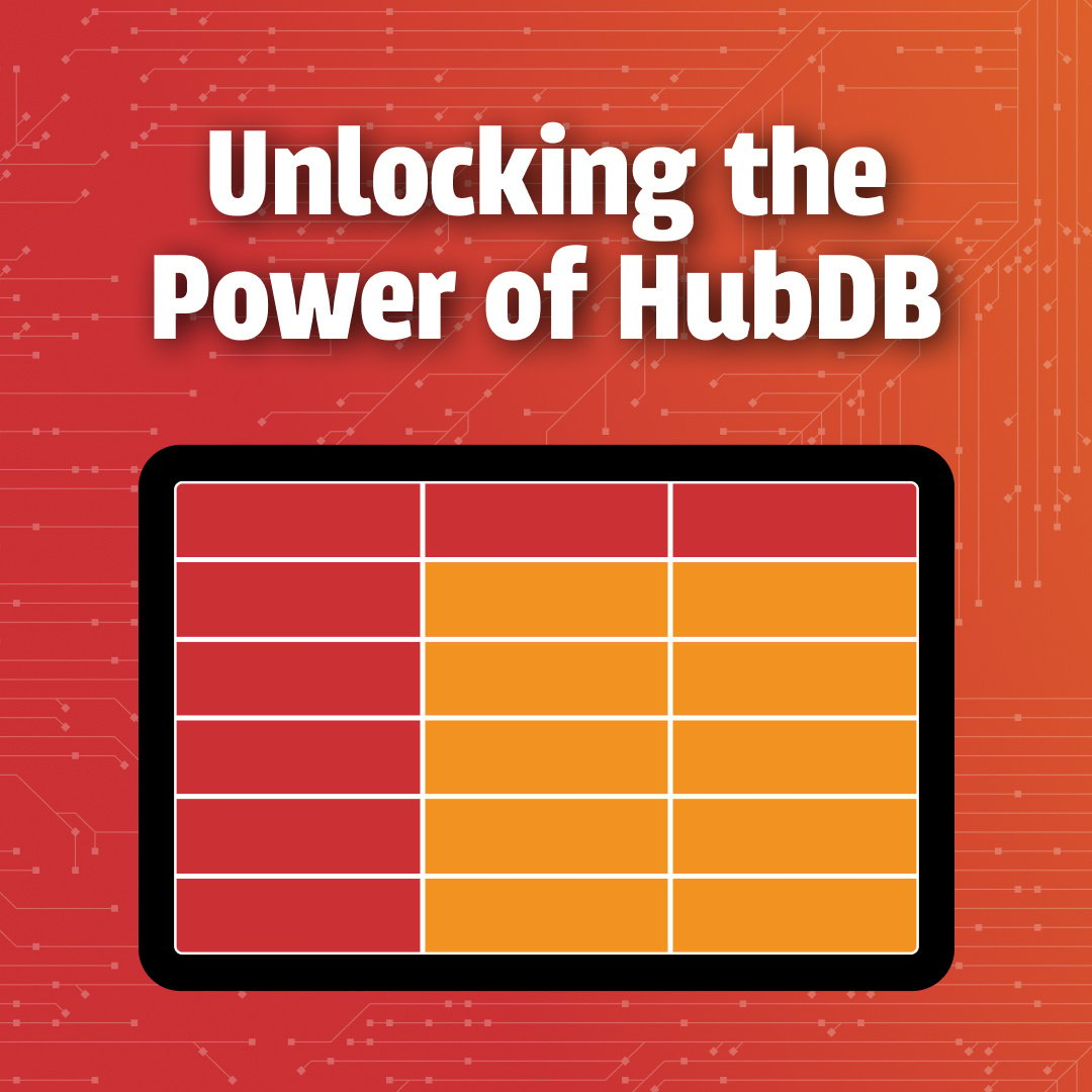

HubSpot is a powerful CMS platform, which developers can use to develop websites and modules for...
What if you could breathe new life into your existing content, ensuring it reaches a broader...
Most folks who are using HubSpot, or are interested in using HubSpot have heard how powerful the...
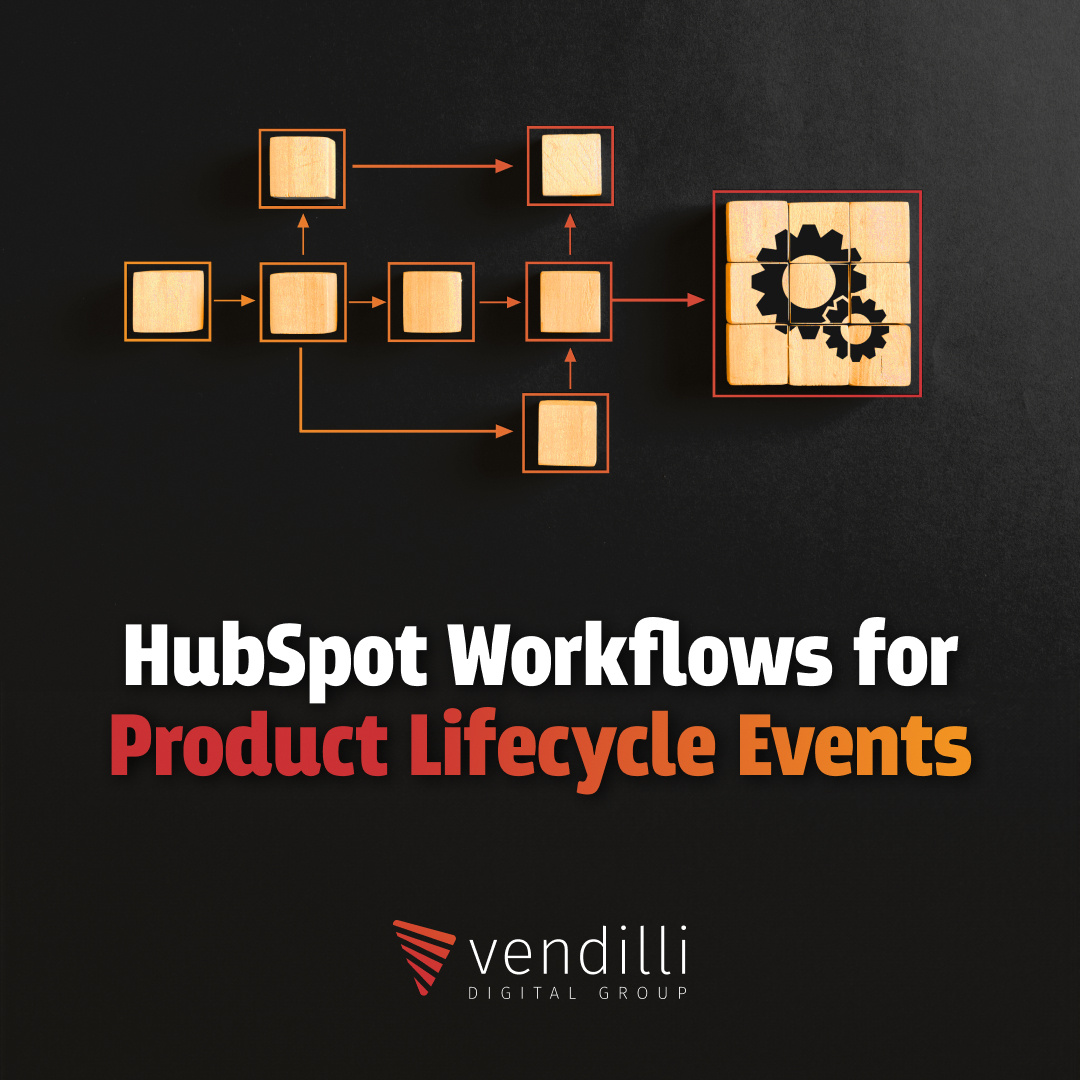
See if this sounds familiar. You have a customer that has bought a machine or product from you that...

Live from Boston... it's Inbound 24! After an 8 year hiatus, I got the opportunity to attend my...