Forms are a necessary evil for converting website visitors into leads. No one likes filling them out. But as the catalyst for a
clean CRM, a more informed sales process, and better reporting, forms should be a cornerstone in your lead generation strategy.
A/B test for length
Generally speaking, shorter forms result in more leads but longer forms produce better quality contacts.
A lead that’s willing to fill out a few extra form fields is typically more invested in their problem and finding a solution.
What do we know about this?
- The average web form length in 2019 was 5 form fields, which usually result in the highest conversion rates. (Hubspot)
Determining your sweet spot for the number of form questions depends greatly on the value of the offer behind the form. Take the guesswork out and find that number faster by leveraging A/B tests. Display one version of the form with four questions and another with six. Keep a pulse on submission rates monthly.
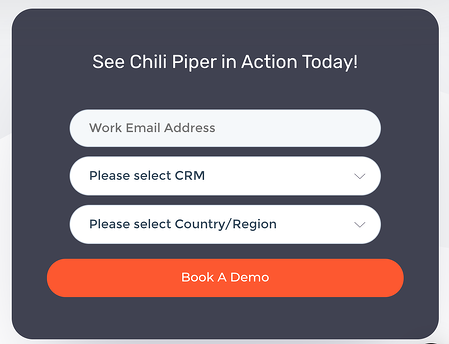
This example from Chili Piper is short and sweet, making it as effortless as possible for their prospect to book a demo and for their business to collect information.
Only ask for what you need
Since shorter forms typically perform better, you'll want to cut down bloat wherever you can. Consider the offer behind your form and ensure that the fields you include are relevant. For instance, it may seem like best practice to include a field for phone number on your form, but if you don't plan on contacting a lead by phone, this field becomes redundant.
-1-1.png?width=450&name=Image%20from%20iOS%20(1)-1-1.png)
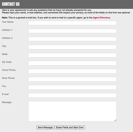
This form contains extra fields like "subject" and "phone number" that are not essential to submitting a comment or question, and create unnecessary points of friction.
Conversely, if you fail to ask questions that are pertinent to your sales process, you could clog your funnel with poor quality, unfit leads. So if your business only serves the United States, make sure you ask for the user's country on your form.
Use a CRM that collects insights for you
Imagine how your conversion rates would soar if you could remove form field questions for:
How is this possible? Use a CRM like HubSpot that uses a massive database to collect that data for you.
Pro tip: Consolidate repetitive questions. By asking your leads for their work email address, you’ll collect their website URL and company, too.
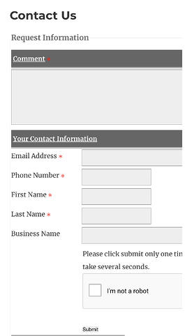
The length of this form could be dramatically reduced with a CRM to collect additional data. With no indication of required fields, all those white boxes will cause potential customers to abandon the form.
Use drop-down form questions
This best practice serves two functions:
- It simplifies your form and makes it shorter. Less scrolling 👏🏻
- It allows you to segment your leads more efficiently
Avoid asking open-ended questions on your form when you can.
Here are a few common examples of where plain text fields can be swapped with drop-downs.
- Job title: You can't possibly create a list of every job title, so instead, ask for the user’s role level where you can distinguish common ones like C-level, VP, and Directors.
- "How can we help you?" Rather than asking for the user’s biggest challenge, present a drop-down with common pain points you hear from your customers.
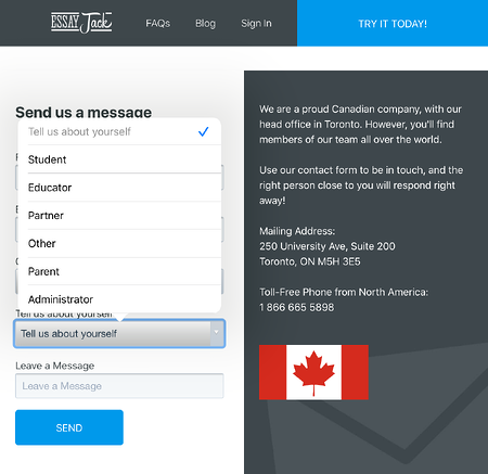
EssayJack leverages drop-downs to minimize open ended questions that leave room for human error, while making personalization and segmentation easy.
Don't bury your form
If your form is hard to find on your website, lives at the very bottom of a long page, or only appears in a pop-up, your chances of getting a submission decreases. Put your form above the fold.
The only exception to putting your form further down the page is for in-depth data capture like application forms. Don't scare off new leads with a lengthy form without clearly communicating the value in disclosing their information.
Churned Free Trials? Steal these 19 ready-to-use email templates to win-back your customers.
Repeat for visibility
If someone misses your form the first time, give them another chance to find it quickly. Or if you’re relying on
pop-up forms, the users who instinctively close the window may not see the form again. Place your form in a few places throughout your site to optimize visibility.
Use smart forms
How irritating is it to enter your information twice on the same website? Most CRMs and lead capture tools enable you to pre-populate known values for returning leads but if you’re choosing new software, ensure this feature is available.
Optimize for mobile
Regardless of your industry, a huge chunk of your website's visitors are on a mobile device. Whenever you make changes to your forms, always test how they look and function on mobile devices. Since scrolling is a natural motion for mobile users, you'll want to use a single-column design to ensure your form flows vertically.
With cut-off fields and an action button you have to squint to see, this form is not mobile-friendly.
Forms demand additional effort from website visitors, creating a point of friction. As a business owner, it's your job to minimize friction by providing a reliable, accessible, and intuitive user experience. For a rule of thumb, remember: the easier it is for your leads to complete a form, the greater your chances are of a submission.
Still struggling with lead quality? Use our
lead scoring template to hone in on your most sales-ready leads.