Pop-ups are everywhere these days.
Stick around on here for a few more seconds and you’ll see one of ours.
There’s a good reason for that: they work.
I’m not a huge fan of pop-ups. I find them annoying and often irrelevant. However, as a marketing professional, I have to put my personal feelings aside and do what the statistics tell me to do.
Before going further, I need to make a point about the type of pop-up I’m focusing on today. We aren’t talking about the pop-ups from 20 years ago (or even five to 10 years).
You remember those. Land on a web page and a waterfall of, “Buy This!”, “Are you interested in that!?!?”, and an assortment of colorful, flashy, and trashy ads appeared on your screen.
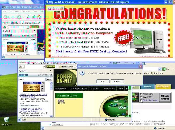
That’s not what I’m writing about here.
This post is focused on pop-ups that have a different goal. These “inbound pop-ups” are used on a company’s website to convert their visitors by providing a useful offer (an ebook or a newsletter subscription are two common examples).
A Handful of Pop-up Stats
Here’s the weird thing about pop-ups, 73% of consumers disprove of them.
However.
Sumo did a study on almost 2 million pop-ups which found that the average conversion rate for the top pop-ups was 9.28%, and was 3.09% for all pop-ups.
While 3% may not sound like much, if you add a newsletter subscription pop-up on January 1 and you have 100 visitors per day and three of those visitors sign up for your newsletter, you’ll have 1,095 new subscribers by the end of 2020.
Small wins accumulate into big ones over time.
It’s not really that we hate pop-ups, it’s that we hate those irrelevant to our interests.
Ready to make pop-ups relevant for your customers? Here are 12 tips that will help.
Make It Easy to Close
Pop-ups can enhance your visitor's experience by showing them a relevant offer. What doesn’t enhance the experience is having to hunt or squint to see the tiny “X” to remove it. Make your offer compelling, but also make it as easy as possible for someone not interested to close it.
It's Appearing Too Early (or not at all)
Your visitor didn't click through to your website to see what kind of pop-ups they'll be presented with. They clicked through because they showed interest in whatever that page was offering.
By bombarding them with a pop-up within the first second or two of their visit, you're not giving them a chance to even make sure they're want to stick around on this page.
More effective pop-up timing focuses on user action -- a 50% scroll down the page, an intent to leave, or time on page (just wait longer than 2 seconds!). In platforms like HubSpot, you can assign multiple triggers, and the pop-up will appear whenever a trigger occurs. This also ensures that all site visitors see your offer. For instance, if you only had a 50% scroll trigger, only people who scrolled down your page would see the offer. Adding an “intent to leave” trigger will present your offer to everyone.
Context is Everything
It may take some finessing of your pop-up rules to ensure the offer matches the subject of the blog or landing page.
Let’s say you have content about off-road driving. Placing a pop-up with an offer of the best sedans would make no sense there, while an offer about the best tires for off-road driving or the best all-terrain vehicles for mudding would be perfect.
For your decision pages, you could set a pop-up that outlines the pros and cons of choosing your product over others (How MudHugger Tires Compare to the Competition, for example).
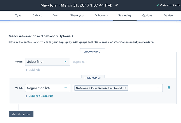
You're not segmenting existing leads
Have you ever visited a site, only to see the same offer you already downloaded? Or a newsletter pop-up on blog you're already subscribed to?
Give your audience something new (or simply choose not to show them a pop-up) rather than being lazy and creating one offer that everyone sees
You could segment by new customers and show them a pop-up survey asking how much they love your product or an upsell offer.
HubSpot has a nice feature on their free pop-us tool that allows you to exclude certain lists (like your customers) from seeing certain offers.
It’s Ugly
Not every pop-up needs a beautiful image as part of its design, but make sure your pop-up looks professional. HubSpot pop-ups are easy to use and provide a basic level of a designed look-and-feel even for non-designers. You might not win a design award for your first one, but you won’t embarrass yourself either.
Tell Them What They’re Getting
Be specific. If you're using a pop-up to promote your newsletter subscription, tell readers why they should subscribe. What can they expect to receive? How often?
If you’re directing people to a survey, tell them what will happen when they click. Don’t let your audience wonder about what’s going to happen when they click your pop-up, tell them what will happen and what they’ll receive afterwards.
Deliver What You Say You’re Delivering
No one likes to be lied to. Your pop-up is a promise to your reader. When they click on it, make sure that you deliver on the promise that led to that click. Make sure your language matches the offer you ultimately deliver.
IT'S TOO BIG (OR TOO SMALL)
Pop-ups come in a variety of sizes -- from full screen to a more discreet box that slides in at the bottom of a screen.
Here’s what works best:
It depends.
After doing research and identifying what you like, you decide to create a pop-up that covers the entire screen. You receive nearly zero results. After a month, you tweak the placement and have a smaller pop-up drop down from the top of the page. With the same offer and language, you reach a 7% click rate. Great.
Experiment with different sizes and placements of your pop-ups to find out what works best for you audience and on your website.
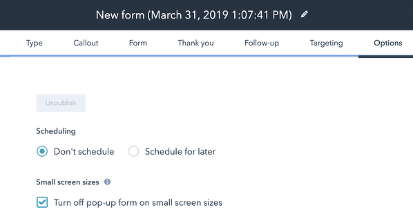
Consider Turning Them Off for Your Mobile Visitors
Google penalizes sites with “intrusive interstitials” (pop-ups for us non-technical folks). In HubSpot, it’s simple to prevent pop-ups from appearing on mobile devices. You simply click the box in the “options” tab when creating a pop-up to “turn off pop-up form on small screen sizes.”
You Never Change Them
You don’t need to change them daily, or maybe even monthly, but test, evaluate, and tweak your pop-up design, placement, and offer over time.
Listen to Your Audience
While I think most of us are resigned to the idea of pop-ups, your audience may 100% despise them.
If you’ve never tried pop-ups before and you suddenly begin to receive more negative responses via email, phone calls, or in person reacting strongly against pop-ups, they might not be right for you. Like any marketing tool, pop-ups will be more effective for some companies and less so for others. In the end, it’s what YOUR customers think that matters.
Too Many Pop-Ups
Be mindful of any other widgets or apps you're using on your site.
If you have a chat box on your pages that automatically opens when a visitor lands on your site, you can still add an additional pop-up, but pay attention to your stats. If your goal on a page is to answer customer questions via chat, don’t get in your own way by offering something else just because you can.
EXAMPLES OF POP-UPS WE LIKE
Here’s a small sampling of a few pop-ups we like.
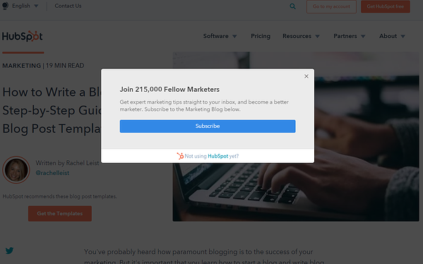
HubSpot Creates FOMO
Of course we had to include a HubSpot example! One of the most common uses of pop-ups is to offer a newsletter subscription. HubSpot has been using a similar pop-up for years. Located on their blog, it appears on a 50% scroll of the page. HubSpot creates an essence of FOMO (the fear of missing out) by showcasing how many marketers are taking advantage of their tips. By not joining them, you’re falling behind.
Notice the contrasting color to the HubSpot color branding scheme to make it stand out. Easy to close if you’re not interested and a simple, one-step sign-up. If you have a newsletter, copying HubSpot here is a good place to start if you’re ready to grow your list.
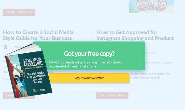
Social Media Examiner Presents a Downloadable Offer
This site is full of marketing advice. They regularly publish free ebooks. This is their most recent ebook signup from their home page. It activates on scrolling and on exit intent. Notice the simple image to show you exactly what you’re getting, the contrasting yellow button with straightforward language, and the precise, descriptive copy.
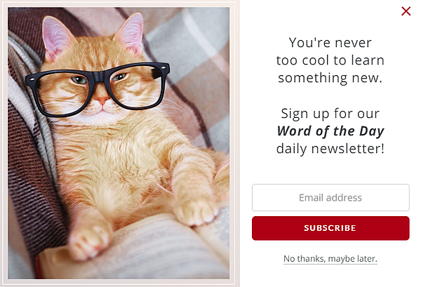
Merriam-Webster Uses Humour
Personality and a bit of quirkiness can work extremely well. The image grabs your attention and the simple subscription makes it almost a no-brainer to sign up because who doesn’t want to learn something new?
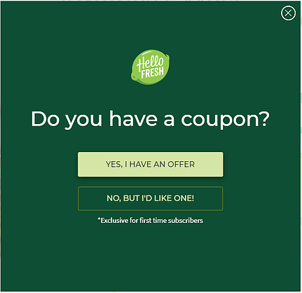
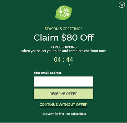
HelloFresh and Pay Less
Who doesn’t like a deal? HelloFresh combines a few different elements in these two pop-ups: new customer and new customer coupon, plus scarcity and FOMO with the countdown clock as the deal is about to expire.
To overcome the worry of using a home delivery meal service for the first time, they offer a discount to everyone who first visits their site. If you ignore the initial pop-up and read through their product pages, you’re then given a more detailed offer, complete with countdown to combine the desire to pay less with FOMO on the deal.
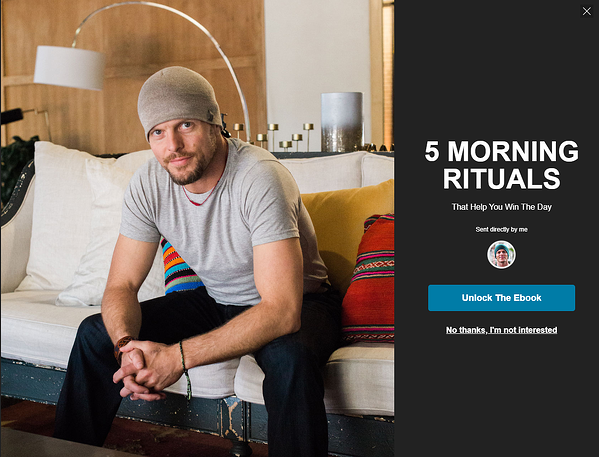
Tim Ferriss and the Screen Takeover
Author of The 4-Hour Work Week and a handful of other books, Tim Ferris uses his blog to share useful information and create newsletter subscribers. If you’re not a subscriber, you’ll quickly see a pop-up with an offer for an ebook that will help you get your day started right. It’s simple, easy to dismiss if you’re not interested, and takes seconds to sign up for.
His site is also an excellent example of branding. All of the elements work together to showcase the focus of his work: translating advice from successful people into actionable steps we all can take to be successful in our own lives.
Pop-Ups: Start Using Them
Pop-ups work. If you’re a HubSpot customer, begin planning how to use them for your inbound marketing efforts today.
As you travel the Web, keep note of pop-ups that you find attractive and appealing. What made you click? There’s nothing wrong with modeling your pop-ups on what others are doing (trust me, marketers do this ALL THE TIME!).
Start with a simple pop-up to begin testing the waters. Evaluate, learn, and begin generating more leads.