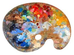
 Certain websites have the power to make their visitors feel a specific way based on web design elements alone; whether it's a matter of longing for a pair of shoes or neutralizing the anxieties caused by seeking out the best interest rates. The cause for such visceral, emotion-fueled reactions? Namely, color.
People engage with color on a moment-to-moment basis and its impact is often overlooked. The physical, psychological, and sociological impact of these colors, however, should not be ignored; especially when it comes to web design.
Why do you think the Google logo's color palette mimics the well-known emblem of the Olympic Games? And why do we associate a "red dress" immediately with a single notion? The answers to these questions will greatly bolster the immediate visual functionality of any website.
Let's start with the color red. It is primal and urgent, the color of blood and the petals of the most ubiquitous rose. Immediately there is a sense of passion, of life or birth, while simultaneously the notion of death and war. A powerful color, red should be used in moderation, or otherwise in perfect balance with any contrasting tones. Coca Cola, for instance, has found the perfect blend of classic type within a sea of red to sell their caffeinated soft drinks.
Blue is a calming tone that exists frequently in nature, from the sea to the sky and many places in between. In some cases exposure to the color blue can actually be said to reduce blood pressure. It seems, then, that it's no mere coincidence that many banks and financial institutions have chosen blue as their predominant hue of choice.
The most frequently occurring color of all is green, and not strangely. Green is the color of the forest, grass, and is synonymous with wealth and the almighty dollar. For this reason many financial institutions will attach this color to their brand image. Similar to blue, green has relaxing properties which allows the viewer to feel more at ease, especially when dealing in the often anxiety-provoking process of personal finance.
While yellow is generally a happy tone, orange finds itself glowing with a bit of the aggression of red, though with less of an edge. Gray tones are those attached to sorrow and detachment, akin to an overcast and sullen day. With little frequency will the gray website be encountered for this very reason: few people are searching for cloudy interactions.
The manner in which one utilizes the multitude of tones in the context of the web design elements a page is built upon will determine what exactly is being said- before the words have a chance to be read. This is the seeming alchemy of the use of color in web design: subconsciously the viewer is drawn in as a result of the colors chosen. Having a sense of balance and rhythm when it comes to color choice and placement, such as the weight of each color as it is displayed on the page, is of the utmost importance. The ability to manage this weight, though it may seem it at times, has nothing at all to do with magic.
And what of the Olympic rings and the Google logo? Simple. The integration of such a variety of hues triggers a sense of large-scale integration and oneness: one search engine for all of your web-based needs and one sporting event for all of the people of the world.
When designing a website it is crucial to take color into consideration. Whether the page relates to sandals or a savings account, it's best to be aware of what the colors are saying first, and then make sure the words on your site bolster and expand upon this message.


