As marketers, we often follow our gut feelings. After all, we know our audience and the services we offer like the back of our hand – so it’s easy to assume we know exactly what headline, page layout, or form will perform the best. 🖥️
But let’s be honest: even if your instincts are right, wouldn’t it be great to have some concrete data to back that up? And since we’re all human, we’re bound to make mistakes once in a while. That means you could be just a few assumptions away from a website that truly resonates with your audience, attracts more leads, and converts a higher number of potential customers.
A/B testing is the key to leveling up your website. 📈And it doesn’t have to be complex! With HubSpot’s A/B testing tool on your side, it’s quick and easy to discover if a simple change in user experience or design could have a huge impact on your site’s performance.
Tired of overwhelming website changes but want to improve performance? Try one of our favorite A/B tests, guaranteed to be set up in HubSpot in less than 30 seconds.
10 HubSpot A/B tests that take less than 30 seconds to set up
1. Layout and Template
Sure, you can start small… or you can bring out the big A/B testing guns by experimenting with something like your home page’s layout or using a new landing page template.
Use different structures and present your message in unique ways to see what turns potential buyers into raving fans.
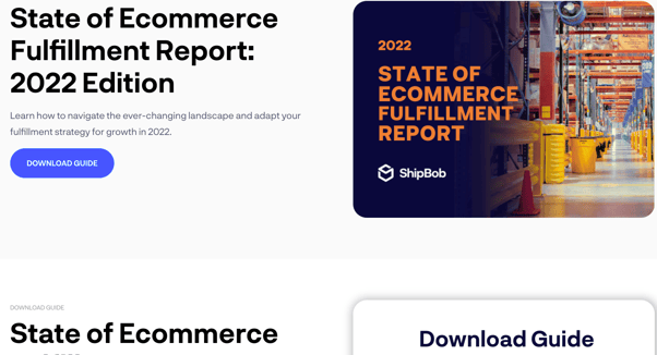
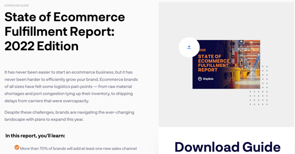
In this example, we changed the layout of this free download page for ShipBob. By making the photo smaller, moving the larger text section up, and changing the layout of the form, we leveled up conversions! 💸
Make one of these changes on a test page and see what happens:
- Reverse the positions of images and copy
- Rearrange the order of your page sections
- Modify the navigation menu
- Swap out an old template for a new one (but keep the same content!)
2. Headlines
Your homepage’s headline is one of the most valuable pieces of real estate your company owns. Are you making one of the most common homepage design blunders by not using it effectively? 😅
With HubSpot’s A/B testing tool, you can enter a variety of headlines and watch as the system creates multiple test pages for you. No duplication or manual effort required!
As your offers and audience change over time, try new headlines and subheadings to see what gets the most clicks.
We get it – writing even one headline can be tough.Try using variations to keep things fresh and exciting, such as:
- A bold benefit: “Get more customers with your HubSpot website”
- A question: “Is your HubSpot website getting enough conversions?”
- An audience callout: “Better web results for HubSpot marketers”


3. Copy
If you can A/B test headlines, then you can test any piece of copy. Come up with unique ways of presenting your message, then find out which sparks the most excitement from your audience. 📝
We’re not just talking about WHAT you say, either. Think about experimenting with things like:
- Short, snappy copy vs. longer copy
- Formatting (bullet points, spacing, and so on)
- Tone and voice
4. Functionality
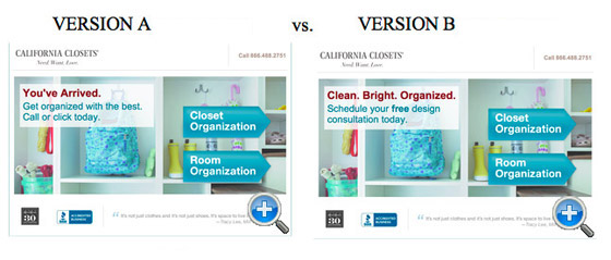
HubSpot has a huge variety of modules and elements you can add to your website. Have you ever wondered if adding something new (or taking something away) could make your site even better?
While it’s great to have all kinds of functionality at your fingertips, you want to make sure they’re actually making a difference for users. ⚙️
With content in hand, you could set up any of these tests in less than 30 seconds:
- Testimonials or other social proof on your home page
- New functionality like a calculator
- Removing social sharing buttons or a video in case they were a distraction
- Fancy hover effects
5. Offers
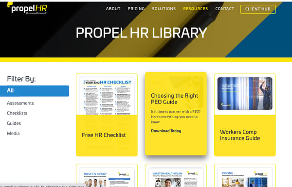
You make an offer to each website visitor. Whether it’s to learn more, sign up for a demo, or download a free resource, you’re always trying to capture the audience’s interest, educate them on what you do, and encourage them to become customers.
But different groups need different things. Are you sure your audience actually WANTS what you’re offering them?
HubSpot’s A/B tool makes it easy to test offers. Why not shake things up by testing the performance of offers like:
- Case studies vs. guides vs. ebooks
- A written resource vs. a video
6. CTA Buttons
Every marketer’s go-to testing ground: the CTA button. After all, there’s just so much you can do with them in HubSpot!
It might seem unlikely, but something as simple as the color of your CTA button can have a HUGE impact on conversions. Don’t be afraid to try out a few things and see what performs best.
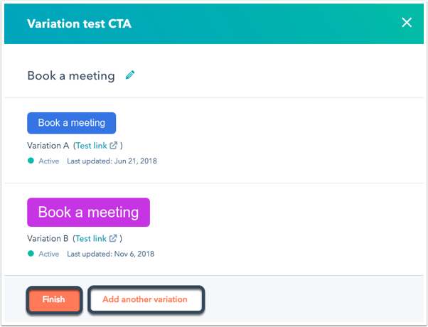
🖱️Mix up your CTA’s with some of these 30-second tests:
- Placement on the page
- Color and contrast
- Shape and size
- Text (e.g. Learn More vs. Sign Me Up!)
7. Forms
You should ALWAYS be optimizing your HubSpot forms. How else are you going to know if you’re missing out on tons of potential leads?
No one likes a nosy company. If your form has too many fields, you might be turning off potential customers… but if it has too few, you could be missing out on valuable info that people would offer up freely.
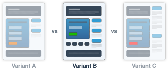
The next time you’re wondering about conversions, try running an A/B test around something like:
- A short form vs. a long form
- Drop-down vs. fill-in questions
- Headlines and button text
8. Images
Too many marketers put images at the bottom of the priority list in web design. Doesn’t anyone remember that a picture is worth a thousand words? 🖼️
While a strong image can set the tone of a website and provide insight into what you do, an inappropriate image can give the wrong impression and actually deter customers.
In the same vein, if you use an image that takes too long to load or is impossible to read on mobile, you’re sure to send customers running.
A/B test your images’ performance by:
- Swapping a product photo for an image of a person
- Replacing a stock photo with a real picture
- Trying a photo with a different primary color
- Moving photos to different locations
9. Banners and pop-ups
Pop-ups are often seen as the annoying little sibling of websites: someone that shows up and pesters you at the most inconvenient moment. But if you can leverage them the right way, they can be an effective way to attract your audience to new and exciting offers.
To make sure your banners and pop-ups are helping rather than hindering, run A/B tests to see what results in the best conversions. Consider things like:
- The size and layout of the pop-up
- When and where it appears
- How users can interact with (and exit out of) the pop-up ❌

10. Blog structure
One of HubSpot’s greatest features is its powerful blogging tool. But did you know you can run A/B tests on your blog content, too?
Try adding different layouts and functionality to your blogs to see what inspires readers to keep clicking.

It’s quick and easy to test out the following in HubSpot:
- Including or excluding author names and publication dates
- Sidebars or footers promoting other posts
- Search and table of contents functionality
Quick tips for A/B testing
Are you ready and excited to start A/B testing and get better results on your HubSpot website? Awesome! For the best chance at success, keep these tips in mind as you go:
✅ Only test one variable at a time. If you make multiple changes, you won’t be able to tell which one truly made a difference. Make iterative changes over time instead!
✅ Have a goal. Don’t just test for the sake of testing. You should have a concrete achievement in mind, such as lowering bounce rate or increasing conversions.
✅ Run tests at the same time. Test your changes with different audiences, but at the same time. You want to make sure your results aren’t impacted by something like the time of year.
✅ Take action and continuously improve. You have to use what you learned! Use the results of your A/B tests to make changes, keep testing, and continuously improve your website for your customers.
PSST: Don’t forget you can A/B test emails in HubSpot, too! Before you hit ‘send’ on that next campaign, use the handy A/B tool to set up two or more variations. HubSpot will send each version to a small portion of your audience, then send the winning email to the remainder of your list.
Try switching up one of these parts of your email and see how your audience responds:
- Subject line
- Images
- Copy or offers
Click here for more tips on leveling up your emails with HubSpot’s software! 📨
Start A/B testing in your HubSpot portal today
HubSpot’s A/B testing tool makes it quick and easy for marketers at any level to experiment with different elements of their site and see what generates the best results for their website.
Are you having trouble setting up an A/B test? Wondering if you’re using the right variables, or reading the results correctly?
We can help! Our experts have helped dozens of business owners set up beautiful, effective websites that take advantage of everything HubSpot has to offer… including A/B testing. Get in touch today.


