HubSpot boasts one of the best landing page design platforms out there. It has tens of thousands of templates, easy drag-and-drop editing, and features like smart content to automatically personalize your site for different audiences.
That means anyone, from the brand new business owner to the expert designer, can use the platform to build landing pages that wow your audiences and get results.
There are so many amazing HubSpot landing pages out there, we had a hard time choosing what ones to use for this blog! Here are eight that really stand out, plus some best practices you can learn from each one.
1. Curaytor: Download a playbook lead magnet
Curaytor helps real estate teams generate high-quality leads that are easier to convert. When they asked us to design a landing page for their new lead magnet, we knew we had to create something beautiful and powerful to reflect their lead gen expertise.
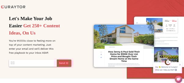
The headline of the page instantly presents a benefit (‘Make your job easier’) and explains how to do it (‘Get 250+ content ideas’). The language is casual and fun, not stuffy and formal. And by removing any unnecessary fields and only requiring an email address, we’ve made it super easy for interested readers to opt in.
Thanks to HubSpot’s tools, we were easily able to remove distracting header navigation, include a chat widget, and add some photos to set expectations on what’s inside the playbook.
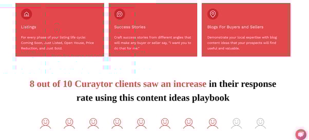
The page continues with three examples of what readers will find in the playbook, tailored exactly to the audience and their needs. The text blocks present info in a clean but eye-catching way. Then, we used a powerful bit of social proof along with a cute cartoon to tell readers exactly why they need to download.
At the bottom of the page, we added a ‘Get My Playbook’ button to bring users back to the form and prevent any unnecessary drop-offs.
Implement best practices from this design:
- Use reader-focused language and give concrete reasons for them to take action
- Collect only the info you need to streamline sign-ups
- Remove distractions and keep it clean
2. Newor Media: Sign up for a free trial
Another of our amazing clients, Newor Media uses their technology to make companies more money with their website ad space. They needed an exciting new landing page to explain their somewhat-complex product and convince readers to try it out and see the benefits for themselves.
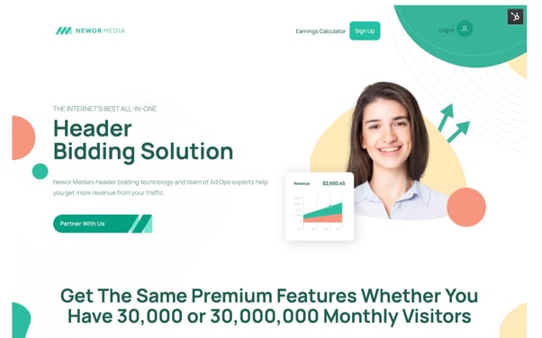
We start with a header that clearly defines who we’re speaking to. If you’re not looking for help with header bidding, Newor Media is not for you. We also tackle a negative assumption the reader might have: you can access premium features even if your website isn’t hugely popular.
The page’s imagery instantly makes readers think of growth, and the “Partner with us” language is inclusive and helpful.
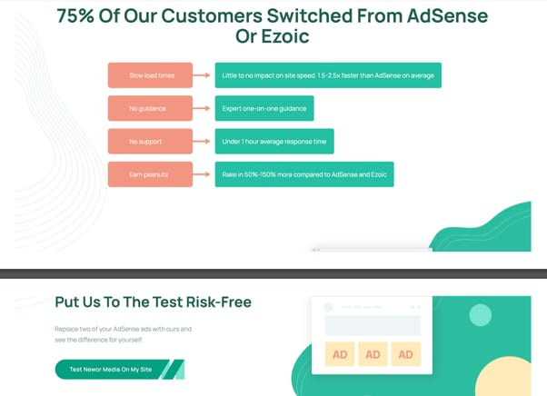
In this next section, we’re calling out platforms that the audience is probably already familiar with, making sure our message is familiar and relatable. We also include some concrete examples of how Newor Media can outperform those competitors.
Then, we break up the page with another Call-to-Action (CTA). We take some friction out of the conversion process by emphasizing that a trial is risk-free and giving a pain-free option to try the product.
In case some readers aren’t familiar with the concept of header bidding, we added a few FAQs to answer questions and ease their minds.
Finally, we finish the page with a form and testimonial. Since the product is a bit more complex, we added some disclaimers at the top of the form and require users to submit their company name and website URL.
Implement best practices from this design:
- Give readers everything they need to know to make a decision
- Look for unique ways to explain and illustrate your product
- Ask more qualifying questions for fewer, but higher-quality, leads
3. ROI Hunter: Contact sales
ROI Hunter’s software helps advertisers unlock more return from their campaigns, no matter the platform. The main CTA of the site is to contact sales, which leads us to this landing page:
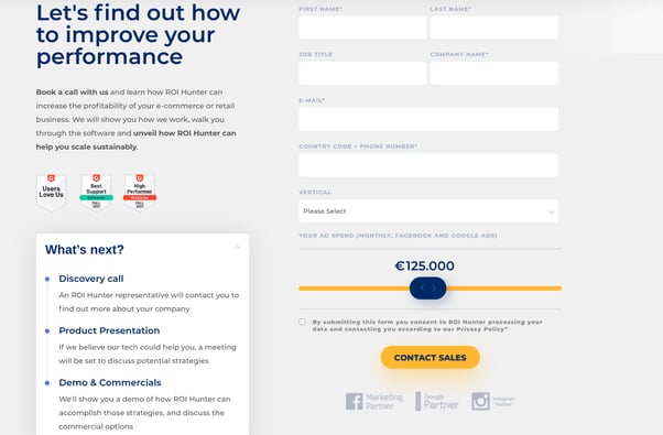
Right away, readers understand the benefit of contacting sales: learning how to improve their ad performance. The page also sets clear expectations of what happens next, so there will be no surprises that could impact conversion rates.
The sliding scale for ad spend adds a pop of color and uniqueness to the form. Icons from G2 Crowd (a popular software review site) and well-known ad platforms including Facebook and Google add some authority to the page.
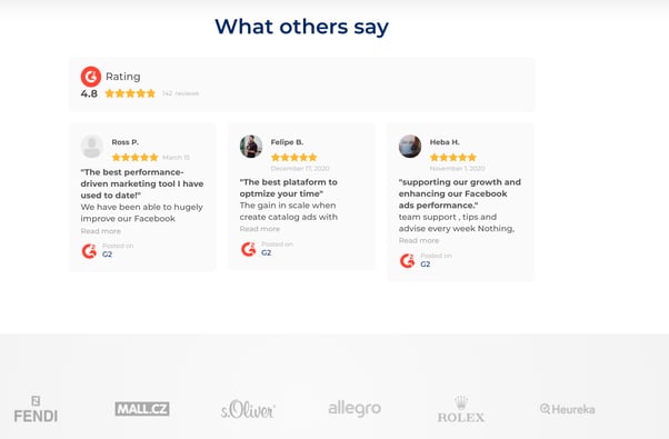
ROI Hunter understands readers need extra proof from people like them in order to make a decision. A rotating view of raving reviews plus a display of well-known brand names adds credibility and inspires users to sign up and see if they can get the same results for themselves.
Implement best practices from this design:
- Set clear expectations for the customer
- Leverage testimonials and other forms of social proof whenever you can
4. Quinyx: Get a software walkthrough
For anyone who has ever struggled with scheduling, Quinyx comes to the rescue with AI-powered workforce management. With so many features and potential customers, they made the wise decision of building out separate landing pages to speak to individual industries.
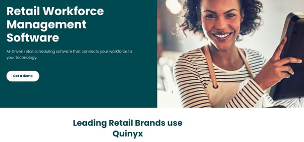
The page header includes an eye-catching and relevant photo with a person looking directly at the camera, a short but sweet description with a benefit, and an instant call-out to the target audience.
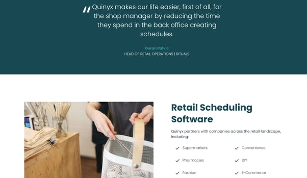
A notable quote from a Head of Retail Operations gives an extra bit of credibility to the page. It also speaks to a frustration that the readers can relate to: if they can see themselves in the pain you’re describing, they’re more likely to listen to your solution!
Then, Quinyx dives into specific use cases and highlights all the incredible businesses that could benefit from the software. Any user who falls into these categories will feel as though the product is designed just for them.
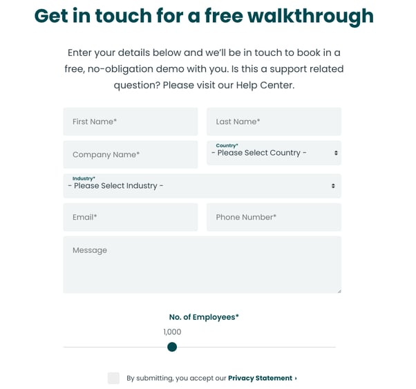
The page ends with a form that emphasizes the demo is free and no-obligation. The gentle language encourages users to sign up without worrying about receiving a heavy-handed sales pitch.
Implement best practices from this design:
- Segment your audience so you can speak to their individual needs
- Highlight a struggle your readers have and how you can help them solve it
5. Admiral: Demo relationship software
With Admiral, businesses can build better relationships with their website visitors. They use clean, engaging landing pages to promote each of their business solutions, including email list building and data management.
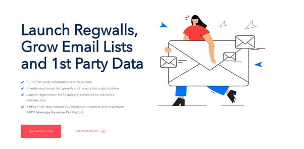
Each individual section slides into view as users scroll down the page, making it more interactive and visually appealing.
Admiral lists the benefits of their software in easy-to-digest bullet points. The buttons are interactive and change colors as the user hovers over them, while the image adds a pop of color as well as some fun to the design.
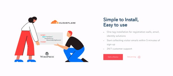
Original, colorful graphics catch attention while also illustrating the uses of the product. CTAs are scattered throughout the page to make it easy for users to convert at any stage.
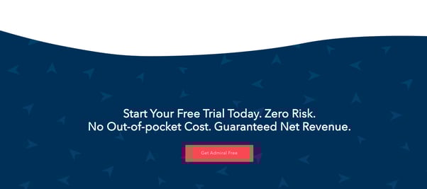
The bottom of the page ends with another prompt to encourage readers to try the product and allay any last minute concerns.
Implement best practices from this design:
- Use bullets, headers, and short text to keep readers engaged
- Don’t shy away from multiple CTAs, as long as they serve the same purpose
- Use colors and graphics to break up your page and make it stand out
6. CycleBar: Book your first session
CycleBar is a premium indoor cycling experience with six class types designed for any body and fitness level. And with nine studios across four states, they needed a sign-up page to get people pumped up and ready to start cycling at a location near them.
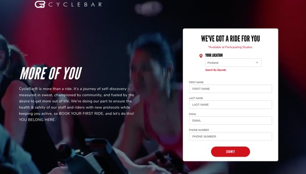
This landing page has a clean design, with no header navigation or distracting elements to draw the readers’ attention from the main purpose: signing up for their first ride.
The background of this top section is a looping video of cycling classes full of people looking motivated and proud of their exercise accomplishments. It really helps readers visualize how they could fit in.
This energy is matched in the tone of the paragraph: CycleBar really emphasizes a welcoming, inclusive community that inspires anyone and everyone to get involved.
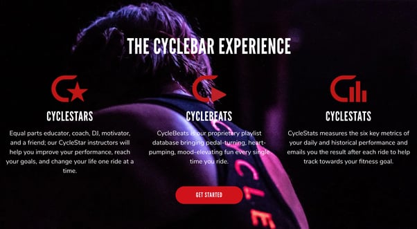
CycleBar isn’t just any normal spin class, either: They use this section of the page to emphasize what makes them unique and really see the customer on it being a fun, enjoyable experience that can also benefit their life.
The CTA buttons are clean, eye-catching, and bring the reader directly back to the form for easy sign-ups.
Implement best practices from this design:
- Use videos when appropriate to catch attention or illustrate a complex concept
- Highlight what makes you different from your competitors
- Use a design and tone that matches your brand
7. Breathe: Calculate holiday allowances
Breathe offers HR software as a service to small and medium-sized enterprises. They wanted to increase their ranking in search engines and generate new leads from website traffic. The solution? Adding a calculator to their landing page.
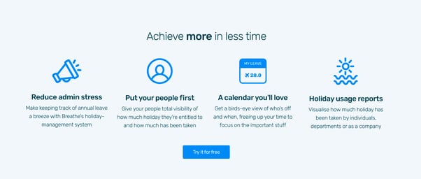
The neutral background of this landing page makes the blue icons stand out, attracting the eye and then drawing it to the matching ‘Try it for Free’ button.
Breathe leads with a benefit that all HR professionals are looking for (‘achieve more with less time’) and then speaks to them directly: using second-person language and giving specific examples of how their software makes lives easier.
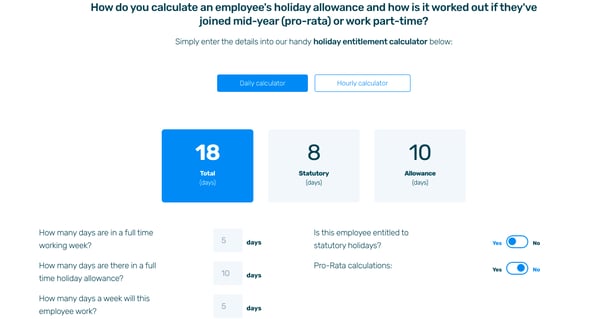
The page continues with a calculator readers can use to determine an employee’s holiday allowance. This calculator is completely functional, gives the user a reason to spend more time with the brand, and showcases one of the software’s convenient benefits.
According to Breathe and HubSpot, this calculator received over 40,000 leads when gated, and is one of the most popular website pages for driving new free trials.
Implement best practices from this design:
- Focus on the benefits to your audience, not the features of your product
- Add interactive elements like calculators to engage your audience and demonstrate what your products and services can do
8. Paymash: Get started (locally)
Looking for help with managing your online store, POS system, and invoicing, all through a mobile app? Paymash has you covered! As a business serving eight different European regions, they needed a way to customize their landing pages to the needs and challenges of each local market.
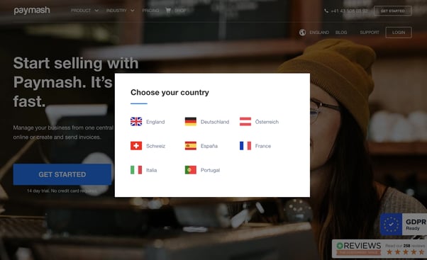
When users first arrive on the site, they’re prompted to choose their country. This will change not only the language of the site, but the layout and content, too. HubSpot’s system helps Paymash cater to multiple regions and quickly publish unique content to individual locations.
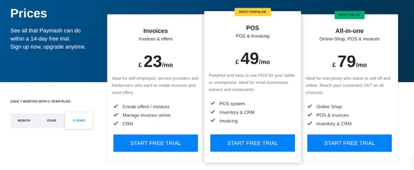
It’s even easy to build pricing pages in HubSpot. This page is interactive, allowing users to toggle between monthly, annual, or 2-year pricing and observe the changes. And of course, the currency is updated depending on the user’s country.
The features of each tier are extremely clear in a checkmarked list. Including a free trial CTA button for each option adds symmetry to the page and makes it easy for the customer to sign up with little obligation.
Adding ‘Most Popular’ and ‘Best Value’ tags draw the readers’ eyes towards the higher-priced, more premium plans.

After a chart that compares the features of each plan side-by-side, the reader is prompted one final time to get started with a free trial. If they’re not totally comfortable or ready to make that step, Paymash gives them a second, even easier option: request a demonstration of the product.
Implement best practices from this design:
- Use smart content and personalization to adapt pieces of your site to unique audiences
- Strategically highlight your pricing packages to persuade your audience
- Make sure your CTAs match the commitment level of the reader
Have you built a HubSpot landing page?
Whether you want your readers to download a piece of content, sign up for a trial, or simply get in touch with you, a well-designed landing page will encourage them to take action and eventually become a customer.
If you need help planning, optimizing, or building a HubSpot landing page from scratch, look no further! With over 7 years of HubSpot experience, we know
how to build pages that appeal to your audience and get more clicks, leads, and sales.
Learn more at https://www.horseshoeco.com/hubspot-cms or get in touch with us today.