The homepage of your website is one of the most valuable pieces of real estate that your company owns. After all, it serves as the first impression for countless customers, gets the most views, and acts as the door into the rest of your site.
Despite this, many businesses don’t pay enough attention to the design of their homepage. Unlike a landing page that serves one dedicated purpose, your homepage needs to solve different problems for different groups of people. That means you must design it strategically.
And it’s not just enough to look amazing: it needs to provide a good experience, too. Research shows that website visitors decide to stay or leave in 10 seconds or less – meaning if your homepage misses the mark, your potential customers are going to bounce and never come back.
Here are 12 of the most common homepage blunders we see when helping our customers design or recreate websites that are beautiful AND functional:
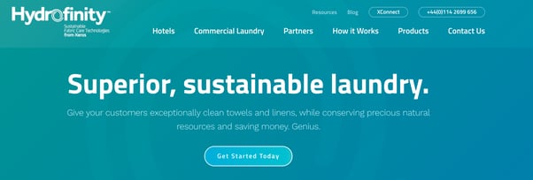
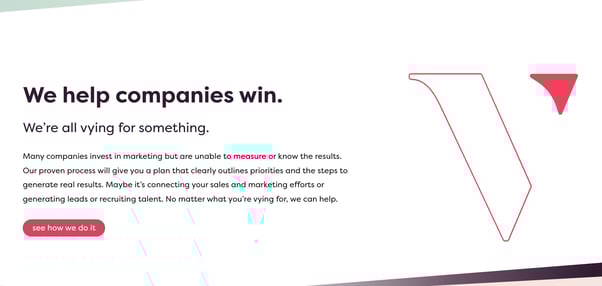
1. Using a vague or irrelevant headline
Have you ever been to a website where even after scrolling through the entire homepage, you’re still not really sure what they’re selling?
This is a CRUCIAL mistake that far too many companies make. Don’t assume customers know who you are or what you do – you need to tell them!
The headline of your homepage is the very first thing your users will see. Don’t waste this crucial real estate with a bland, irrelevant message like “Welcome to our website!”
Instead, use a powerful, punchy headline that tells readers who you help and how you help them. Sum up your solution to their problems in as few words as possible.
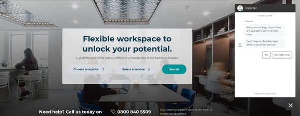
2. Hiding CTAs below the fold
A Call-to-Action, or CTA, is usually a button that inspires your readers to click and take action. It might be something like “Sign up for a sales call”, “Download now”, or “Register for a free trial”.
No matter what action you’re trying to promote, you must have at least one CTA “above the fold” (visible at the top of the page). You don’t want users to have to scroll and scroll to find a hidden button – help them get started right away by being upfront.
Your CTA should be directly connected to the main purpose and audience of your website. Whenever possible, use a contrasting color that stands out from your web design, and make the button text as short and actionable as possible.
3. Not giving clear direction on what to do
There’s nothing more frustrating than visiting a website with a goal in mind… and not being able to figure out where to go to meet that goal.
Your homepage needs to help users understand and find what they’re looking for. A great strategy for this is to identify the 2-3 things your customers most commonly look for when visiting your site (for example, a pricing page and information on features). Then, you can build links to each of these areas into your homepage.
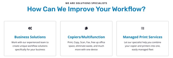
You also need to leverage a strong, easy-to-understand navigation menu across your entire site, particularly for new users who are on the homepage for the first time.
4. Mismatching style with brand
Every business wants a website that is eye-catching, appealing, and easy to read. The problem comes in when business owners prioritize looks without considering the bigger picture.
Your homepage design has to make sense for your audience and what you sell. It should blend in as a cohesive part of your online marketing strategy. For example, if you sell pet toys, you can probably get away with a fun vibe that uses bright colors and funky text. But if you’re a SaaS company, you might need to stick to a more professional feel with calming colors.
No matter your choice, make sure your website features a clean design that meets the needs of you and your customers. To make it easy to read, choose a font that has several clear variations to differentiate between headers, subheaders, and so on.
5. Failing to leverage smart content
Remember how we said your homepage needs to serve different purposes for different groups? Smart content is the answer to your design woes!
With smart content, you can change certain pieces of your homepage for different members of your audience. You can show different headings, content, or images to users based on their:
- Location or language
- Device type
- Lifecycle stage
- List membership
- Referral or ad source
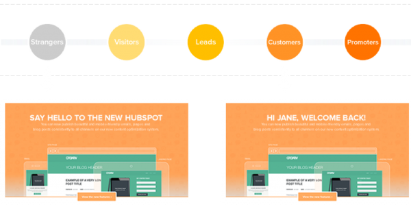
This allows you to create a more personalized, optimized experience without a lot of manual effort.
6. Overusing stock photos
Don’t get us wrong: stock photos are an incredible resource that have their place. But when it comes to your homepage, using real photos or videos is much more impactful.
Yes, your pictures need to be beautiful. But they also need to serve a purpose! Stock photos can cheapen your brand and clutter up your page. By contrast, real photos can increase your credibility, showcase your amazing products, and illustrate how you make peoples’ lives better.
7. Forgetting to mention benefits
When building your homepage, it can be tempting to fill the space with descriptions of your product and all kinds of information about your company’s humble origins.
But ask yourself: Does the customer really care about that?
Your homepage needs to be designed with the end-user in mind. That means you need to tell them exactly what you offer, why it matters to them, and how you’re going to make a difference in their lives.
Keep your benefits short, simple, and to the point. Speak directly to your audience and use their language (that means no jargon!)
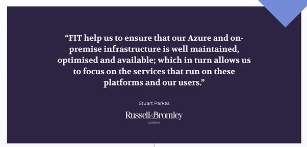
8. Leaving out social proof
You know you’re the best at what you do. But will your website visitors believe the same?
Customers are more likely to accept your claims when they come from an external source, like an incredibly happy customer. If you leave out social proof from your homepage, you’re missing an incredible opportunity to convince them to buy.
Use short, punchy quotes to have the biggest impact. If possible, use names, photos, and/or companies to bump up the credibility even further.
No testimonials? No problem! The logos of companies you’ve worked for, awards you’ve won, or certifications you’ve achieved can all serve the same purpose.
9. Only providing information, not offers
A lot of the people visiting your website aren’t ready to buy yet. But that doesn’t mean they’re not ready to make any sort of conversion at all!
You can leverage resources or content offers on your homepage to increase conversions and keep users clicking. It will also help you capture those people who don’t fit into your primary CTA objective.
Great examples of homepage content offers include:
- Download a guide
- Sign up for the email list
- Access a checklist, ebook, or other resource
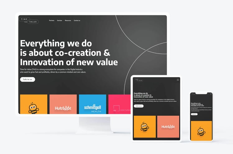
10. Not optimizing for mobile
We can’t believe we still have to say this in 2022, but your homepage (and every single aspect of your website) MUST be designed with mobile users in mind. Some of your users might be using a desktop, but don’t count on them being the majority.
Make sure all of your text is large and clear enough to read without pinching and zooming. All photos must be clearly visible, and embrace white space so your page doesn’t feel cluttered or crowded.
Open your homepage on your phone and ensure everything is functioning as it should be: for example, remove any hard-to-exit pop-ups and make sure all buttons are large enough to be easily tappable.
11. Using the same design for years
Your business isn’t static. Why are you treating your homepage any differently?
Over time, you might make changes in your products and services, the way you communicate with your customers, or the audiences you speak to. When this happens, you need to update your homepage to reflect that change.
Even if you’re not undergoing significant changes, you should always be trying and testing new things. Use an A/B testing tool to make small tweaks over time and see what resonates best with your audience.
If the thought of regularly updating your website gives you a headache, you should consider growth-driven design, a strategy created by HubSpot. A GDD website continuously learns from your users’ behavior and allows you to make updates and launch small, powerful changes in a much shorter timeframe. It’s less risky, less costly, and less of a nightmare for you and your team.
Wondering if the rest of your website needs an overhaul, too? Check out 10 Alarming Giveaways You Need to Redesign Your Website!
12. Missing out on HubSpot features
Is your website built on HubSpot? If so, you have even more options to make your homepage as attractive and functional as possible. Don’t miss out on your opportunity to incorporate features like:
- Chatbots to engage your customers even when your team isn’t available
- Automated workflows and follow-ups based on customer website actions
- Drag-and-drop editing to easily test out new looks
- Reporting and analytics to keep making magic happen
Does your homepage need a redesign?
We all know you’re not supposed to judge a book by its cover. But when it comes to website homepages, you only have a few brief seconds to capture your audience and inspire them to stick around.
Is your homepage in need of an overhaul? Wondering how to get more conversions and fewer bounces? We can help! Our team of HubSpot developers and designers has created dozens of websites for business owners just like you. Get started today!