Looking to generate more leads? Wish your visitors would convert before leaving your website? The secret is strategically placing call-to-actions throughout your content. But with the huge amount of distractions online today, users won't pay attention to uncreative or cliche prompts. Let's review the basics before we look at call-to-action examples that actually work.
What is a Call-to-Action?
(From here on out, we'll refer to them as CTAs.)
CTAs are instructions for your reader on where to click or which action to take. They help turn visitors into leads by guiding users throughout your content to find the information they're looking for. It answers the question: "What's next?".
The end goal of a CTA is to eventually link to a form or a space where a user can convert. Usually, this means a CTA leads to a landing page, however, sometimes you'll need two or three CTAs to get to the form in order to flow naturally and guide your user along the buyer's journey. It wouldn't make much sense to present a "Sign Up Today!" button to a user that's seeing your content for the first time, would it?
So where should these CTAs be placed? What do they look like? What should they say?
PRO TIP: Your CTAs should always include a verb. This is what provokes the user to actually take action.
- Download
- Get
- Start
- Create
- Book
- Call
- Comment
- Share
- Like
- Sign Up
- Try
At the end of blogs
This is one of the most under-utilized real estate from a conversion standpoint. You've just spent a ton of time writing a blog. You researched the topic, crafted the copy in a way that truly helps your reader solve a problem, and you've carefully selected images and screenshots that support your ideas. Hopefully, your personas are interested in the content and read all the way to the end. But when they finish reading, what's next? If you're not clear about the next step, most readers will close the browser.
This is the perfect opportunity for a CTA. When developing your blog calendar, choosing a relevant CTA should be part of that planning process. To determine where to guide your readers to at the end of your blog, it helps to map out your buyer's journey. What's the next logical step a user would take after reading the blog? If the blog is a top-of-the-funnel (TOFU) topic, it probably doesn't make sense to link your readers to a consultation form. They may not be ready for that level of commitment. Instead, link to a relevant freebie or your blog subscription opt-in.
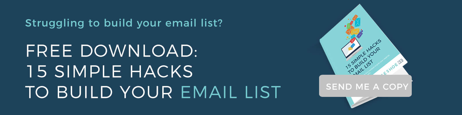
Here are a few examples of an image-based CTAs at the end of the blog that seamlessly guide the reader to a content offer that's totally relevant to the article and helps the business acquire a new lead.
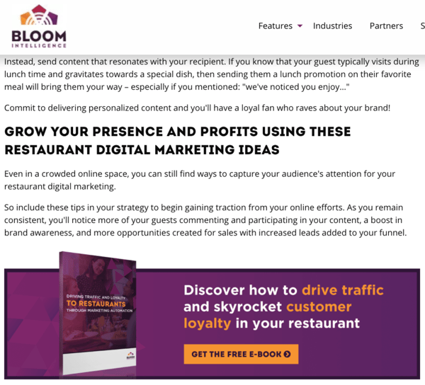
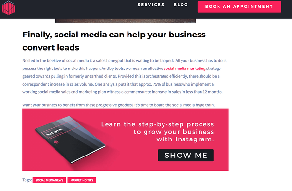
Blog CTA Best Practices
- Use an image as your link. It will stand out from the rest of the copy
- Split test your CTAs. Try variations with different colours, copy, or even offers
- Map out your buyer's journey to determine what the next logical step is (ie. download a freebie or subscribe to your newsletter)
- Include icons to prompt your users to share your blogs on social media
In the middle of your blogs
In an ideal world, people would read our blogs word for word. But unfortunately we know that 48% of readers admit to skimming content.
To combat this, add a subtle plain-text CTA towards the top or middle of your blog. These are also called anchor text CTAs and a lot of news websites do this (and me, too!). HubSpot actually claims that these types of CTAs are how they acquire the majority of their blog leads!
On your homepage
Your website homepage is your first opportunity to catch your visitor's attention and communicate the value your business can provide to them. Without CTAs, people typically skim through websites aimlessly so your homepage is one of the most important pages to place CTAs. They help guide the user to the content they're looking for and conversion opportunities.
Because your homepage is likely designed with an engaging layout, contrasting colours, and images, button-style CTAs usually make more sense to avoid cluttering the page.
Think about how you want users to flow through your website. Here are a few approaches you might use:
Homepage > Learn more about products > Start free trial
Homepage > Download freebie related to pain point > Landing page with form
Homepage > Read blog that helps user solve a problem > Sign up for email updates > Form
PRO TIP: Make sure you've got at least one CTA "above the fold" which means the user doesn't need to scroll to see it.
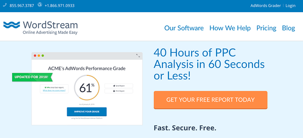
Upon landing on Wordstream's website, we see a very clear button CTA above the fold. The orange pop of colour catches your eye and immediately communicates what to do next with a valuable offer.
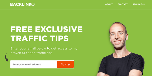
No question what to do next on Backlinko's homepage. Plus, the form is right there! No extra clicks required.
But if someone scrolls right on by, they shouldn't miss the only CTA on your homepage. Make sure you've got buttons placed below-the-fold and as users continue to scroll.

On Your social media posts
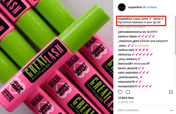
You mean, CTAs shouldn't only be on your website? No! Anywhere you're sharing content with your followers or leads, you should be include a prompt to guide them to the next step. And while you might think your social media caption is merely a place to provide context to the image or article you're sharing, calling your followers to take the next step can actually determine whether or not they keep scrolling or stay engaged.
Examples of social media CTAs can include:
- Tap the link in my bio to [insert benefit here]
- Share this post with someone who needs [insert pain point here]
- Comment below and let me know [insert pain point/goal here]
- Double tap if you [insert relatable statement here]
- Don't have time? Bookmark this post to read later
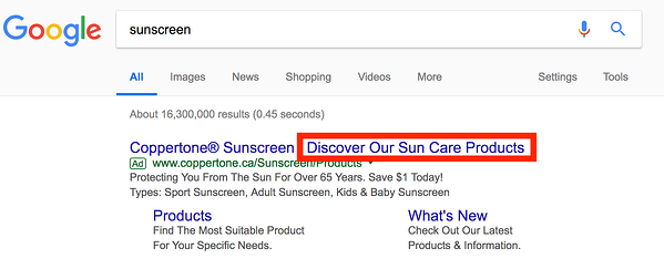
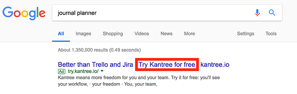
In Your ads
This is arguably one of the most important places to use a CTA. You have a very short window of time to be able to catch your prospect's attention and convince them to click through. Fortunately, placing ads on social media makes it easy to add a CTA button, but you should also emphasize the action you want users to take in your copy. Same goes for placing search ads on Google. Use a verb that gently nudges the user what to do next.
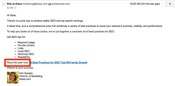
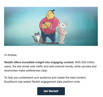
 In Your emails
You know how effective email is, but only if they're optimized with CTAs. Stick to one per email (unless it's a roundup style newsletter) to avoid confusing your reader and making the desired action clear.
Adding CTAs to your emails shouldn't be limited to blast newsletters! Even your lead nurturing or individual sales emails should include a strategic verb-style CTA.
Hopefully these ideas spark your creativity to implement similar CTAs across your content. Come back and comment below with the results you experienced!