The Vendilli team completed a project for our new friend Dave Nelsen over at Dialog Consulting. The main goals of the project were to give the Dialog site a makeover of sorts, to make it responsive to mobile devices, and to make sure it was all powered by WordPress.
Dave also opted for a Google Apps package that I setup and deployed for his domain to include all the run of the mill Google Apps goodies like Gmail, Google Calendar, and etc.
As a social media speaker and strategist, Dave is a guy who is constantly on the move so this cloud based solution really suited his business model and lifestyle. He does speaking engagements and presentations all over North America with a traveling schedule that could easily rival Obama's.
Due to Dave's insane speaking schedule, getting his Google Calendar embedded on the website so that his clientele, friends, family, and other colleagues could all keep an eye on him and his whereabouts, in a way where he could update it from any of his devices on the fly, was a major area of concern for this project.
Considering that Google outright recommends responsive web design, I find it a bit interesting that many Google products are still only available in fixed-width formats. But if you read this far, I'm sure you're hoping there is a solution in the near future, and I assure you... there is!
Our solution for Dave that allowed us to make Google Calendar responsive involved two parts.
Table of Contents
- Part One: Create a Responsive iFrame Container
- Part Two: Take Advantage of Bootstrap's Available Classes, and Google Calendar's Customization Options
Part One: Create a Responsive iFrame Container
I borrowed a bit of code and the idea itself from another blog post I had come across in my adventures of seeking out a solution. You'll see if you take the time to visit that post it mainly addresses the entire issue as covered here in part one, but I didn't write this whole blog post just to share a solution I had found elsewhere... I take it a step further in part two...
That being said, simply for convenience's sake here is the code I borrowed from ThemeLoom, I'm hoping they won't mind considering I threw them two links and cited my source :).
First, add this code to your CSS stylesheet:
[code]
/* Responsive iFrame */
.responsive-iframe-container {
position: relative;
padding-bottom: 56.25%;
padding-top: 30px;
height: 0;
overflow: hidden;
}
.responsive-iframe-container iframe,
.vresponsive-iframe-container object,
.vresponsive-iframe-container embed {
position: absolute;
top: 0;
left: 0;
width: 100%;
height: 100%;
}
[/code]
And there is a Part "1a," you'll want to wrap your Google Calendar embed code inside of a container that tells your site this thing should resize itself a bit:
[code]
[/code]
Part Two: Take Advantage of Bootstrap's Available Classes, and Google Calendar's Customization Options
Once you've setup your responsive iframe container, there's still a few more things you can do to tweak this a little tighter for an optimal user experience for your visitors.
I took advantage of a few of the available classes in Bootstrap and combined them with a few of the customization options in Google Calendar's embed tool which when blended together, made for a perfect user experience.
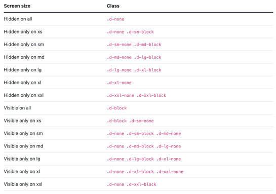
The first thing to familiarize yourself with in order to capitalize on the existing Bootstrap CSS responsive utility classes would be this table, which I screen captured for convenience sake:
The two responsive utility classes that will be of special use in this application will be "visible-phone" and "hidden-phone." Using these two options and the Google Calendar Embed Helper, I actually got the iFrame embed code for TWO different versions of the calendar:
- A full monthly view of the calendar which I made visible to desktops and tablet users
- A more narrow agenda view of the calendar that I used to show mobile phone users.
P.S. - You can get to the Google Calendar embed helper by logging into your Google Calendar that you'd like to make responsive and following this breadcrumb trail:
- Gear Icon -> Settings -> Calendars -> click the title of the calendar you'd like to embed
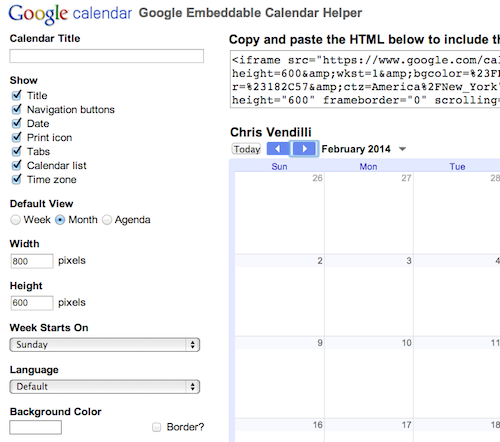
Once you're on this page you'll see a whole section that is described as "Embed this Calendar" and over to the right you'll notice a link that says "Customize the color, size, and other options."
The tool will look like this:

The core concept here is to show the bigger "Calendar View" of your Google Calendar on tablets & desktops, and a more narrow "Agenda View" to visitors using a mobile phone.
You will probably want to toy around a little bit with the width and height options in order to season to taste, but you can see what I eventually ended up with quite easily by scouring the final code I pasted below.
And without further adieu, here's the final code that I embedded on Dave's website so you can see the finished product... you can also take a peek at the actual responsive web page where the Google Calendar is embedded and play with the browser width by resizing to see the end result in action:
[code]
This third party embed for Google Calendar is being blocked
We need your permission to load this Service (Google Calendar). The embedded third party Service is not allowed to display until you provide consent. For this third party feature to load, please click 'accept'.
For privacy purposes, this third party script has been auto-blocked. The website owner needs to follow these steps to add this third party Service to their Termageddon questionnaire. Upon adding this third party Service to the questionnaire, this third party script will be allowed to load based on user consent choices.
Powered by Usercentrics Consent Management PlatformThis third party embed for Google Calendar is being blocked
We need your permission to load this Service (Google Calendar). The embedded third party Service is not allowed to display until you provide consent. For this third party feature to load, please click 'accept'.
For privacy purposes, this third party script has been auto-blocked. The website owner needs to follow these steps to add this third party Service to their Termageddon questionnaire. Upon adding this third party Service to the questionnaire, this third party script will be allowed to load based on user consent choices.
Powered by Usercentrics Consent Management Platform[/code]
Now Dave can manage his Google Calendar from his mobile devices, laptop, desktop or anywhere else he has an Internet connection and almost as soon as he saves a new event, his website's "Speaking" page is near instantly updated. Even better, visitors checking out his site on mobile devices see his awesomely responsive custom WordPress theme complete with is up to the minute speaking schedule.
If you found this post helpful, please leave a comment or give me a Tweet, Like, or Share!


