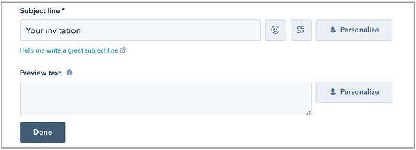
I was working on an email campaign recently and found myself skipping over the preview text section in an effort to save a few minutes. In HubSpot, it looks like this:

Fortunately, I sent myself a few tests of the email and noticed that it appeared in my inbox like this:

Notice the "1-3-Original-White" copy? This is what's known as preview text. It's the short blurb that shows up in your inbox after your subject line on both desktop and (most) mobile devices. And news flash: it's more important than you think. Read on to learn more about your preview text and how it can help you improve your overall email efforts.
Preview Text Character limits
First things first -- how much space do you have to work with? While inboxes vary depending on the client and device, Gmail is the most commonly used. On desktop, Gmail allows between 100 and 110 characters in your preview text. On most mobile devices, Gmail displays between 40 and 90 characters. Use these as general guidelines but keep in mind that there are a few variables that can affect character limits including screen size, browser, and whether the user is holding their mobile device vertically or horizontally.
Why is optimizing your preview text important?
Improve open rates
A recent study found that optimizing your preview text can lead to up to 45% better open rates. With an extra few words, you've got an additional opportunity to incentivize your recipient to open the email. Whether it's promoting a discount or sharing a resource, your preview text can provide more context and encourage an open.
Can reduce spam
Think of your preview text like a prescreening tool. The more context your recipients have, the more likely they'll be to open the email and therefore less likely they'll be to report it as spam. Use your preview text to explain what's inside.
It's supported everywhere
Email preview text will likely appear no matter what app, device, or client your readers are using, so why not take advantage of it? See the image below to understand where and how the text appears on common devices.
How to optimize your preview text
Don't rely on your software to decide
Letting your email software come up with your preview text usually doesn't result in one that screams "open me!". You'll typically see the alt text of your logo used, or the first few words of your email content, which often ends up being the greeting or "view this email in your browser".

Always customize your preview text to align with what's inside the email as well as the action you want your readers to take.
Include a Call-to-Action
What do you want recipients to do with your email? Read a case study? Use a coupon code? Follow you on Instagram? Define your goal and use your preview text as an additional opportunity to convert your reader. Verbs typically work best.

Don't repeat yourself
There's no sense in reiterating your subject line. Use your preview text to communicate different copy and provide more context and an incentive to open up.

Keep it short
More emails are opened on mobile devices than desktop computers. This means your readers are often multitasking or on the go. Ensure your preview text is short and sweet and cuts right to the chase. To optimize for mobile users, try to keep it around 40-50 characters.
Always test
Testing different elements of your emails is always a good idea but be sure to limit your tests to one area at a time. Try different preview texts using some of the following ideas:
- Use an emoji
- Test different verbs
- Try personalization tokens
EXAMPLES OF GREAT PREVIEW TEXT

Why it works: The subject line uses personalization while the preview text provides additional context and incorporates action-oriented language.
 Why it works: The call-to-action is clear as well as the benefit the reader will receive by converting (who doesn't want great skin?!)
 Why it works: There's no questioning what the sender wants the reader to do here. Curiosity is also piqued by using a cliffhanger statement.


