How do you get your website users to do what you want? Tell them, of course! A Call to Action (CTA) is any part of a marketing message that asks potential customers to take a specific action, whether it’s reading a blog post or making a purchase.
Website CTAs are most often clickable buttons. Great CTAs will encourage your site’s users to take the next logical step in learning about your brand and eventually become a paying customer. But there are some rules to follow! Read on to discover four CTA best practices to increase your website’s conversions.
Best Practice #1: Customize Based on the Buyer’s Journey
Everyone who comes to your site might be at a different stage in the buyer’s journey (if you’re not familiar with the journey, check out HubSpot’s guide and templates here). And when you give visitors in different stages the same CTA, you’re not going to get the results you’re looking for.
On one hand, if you ask someone who is reading a blog post to make a purchase or book a sales call, you’ll probably scare them off. They’re not ready to make that step yet.
But on the other hand, you need to be bold enough to ask the people who ARE ready to take the next step. They’ll probably take their business elsewhere if you don’t.
That’s why it’s so important to customize your CTAs based on where the users likely are. Not totally following? Let’s break it down.
The Awareness Stage
In the awareness stage, your potential customers know they have a problem. Blogs (like the one you’re reading) are a great resource for the awareness stage because they provide resources, education, and insights.
Contacts in the awareness stage need a CTA that gently encourages them to keep learning and help name their problem. It should feel like a natural next step that isn’t intimidating. For example:
- Subscribe to our blog
- Sign up to receive marketing tips
- Learn more on our YouTube channel
- This awareness CTA from HubSpot, on a post about how to write a blog:

The Consideration Stage
Potential customers in the consideration stage understand their problem and are looking for all the possible solutions that could help them solve it.
For the consideration stage, use a CTA that encourages them to learn more about your solution. It should set them up to consider you as a service provider, again without being pushy. Some CTAs you could use in the consideration stage are:
- Download my whitepaper
- Read eBook now
- Register for the free webinar
- Read a case study, like in this HubSpot example:

The Decision Stage
Once someone has reached the decision stage, they know what type of solution they’re going to use to solve their problem. They just need to figure out who will provide it (spoiler alert: if you’ve already helped them through the first two stages of their journey, it will probably be you!).
Don’t be afraid to ask for the close with this CTA. Someone who is visiting your sales or contact page is probably ready to convert if you’d just give them a gentle reminder to say ‘yes’. Here are some examples:
- Buy now
- Sign me up for a free trial
- Contact our sales team
- Get a demo, as seen in this HubSpot CTA on a sales page:

Best Practice #2: Designing Your CTA
You’ve figured out what the CTA should be for each page of your website. Great! Now how do you put that into action? There are three important aspects of CTA design that you should think about: visuals, copy, and location.
Visuals
No matter what your CTA button looks like, you need to make sure it stands out on your page as something that users can click on to get a valuable offer.
Think about your target audience when designing your CTA. Are they professionals who would prefer something clean and simple, or casual shoppers who will respond to something flashy and fun? If you’re not sure, the best way to start is by designing your CTA with a color that contrasts from the page background and also aligns with your company’s brand.
Copy
The text on your CTA should inspire visitors to do whatever it is you’re prompting them to do. Use clear and action-oriented language. Don’t make them think too hard about what will happen when they click: tell them explicitly!
For example, copy such as “Subscribe to Our Blog” or “Become a Member Today!” is much more likely to get results than “Click Here” or “Download Now”
Location
Before placing your CTA on a page, remember to think back to the buyer’s journey and make sure this action makes sense for the people reading this page. Align the audience and the offer to make the perfectly clickable CTA.
Be sure that there is some white space around your button and that it’s in a logical place. Whenever possible, place it ‘above the fold’ so that your users will know exactly what their next step is before they have to scroll down the page.
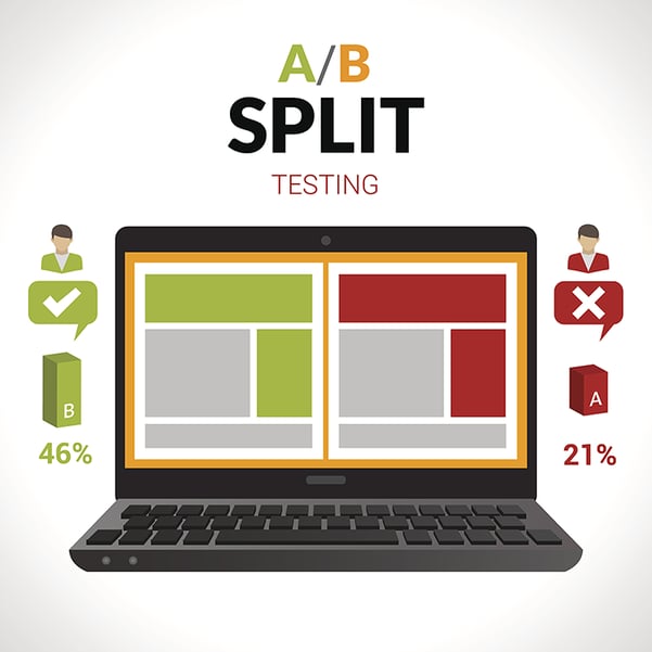
Best Practice #3: Split Testing Your CTAs
If at any point while reading this you’ve thought to yourself: “Oh no, I have no idea what type of button design my audience would respond to!” or “What if two types of CTAs could make sense on X page of my website?”, don’t panic.
There’s always going to be uncertainty in web design (and any type of marketing, really) and the solution is almost always split testing.
You can use HubSpot’s A/B testing tool to launch two versions of the same page at one URL. Half of your visitors will see one version and the other half will see the other. Then, you can compare the data to see what works and what doesn’t.
Pro tip: Only test one thing at a time! If Page B’s CTA has a different color, different text, and is in a different location, you won’t know which factor actually made the difference in conversions. Pick a winning color first (for example) and then move on to other factors one by one. Over time, you’ll find the perfect CTA formula for your audience.
Best Practice #4: Focus on a single action
Have you ever been on a webpage that asked you to do ten things at once? Buttons asking you to contact them, subscribe to a blog, sign up for their latest download, check out their YouTube channel… the list goes on. And did it overwhelm you? Did it overwhelm you so much that you exited the page rather than take any single action?
Don’t make the same mistake on your pages! If you don’t make it easy for your users to know what to do next, they’ll take the really easy option: no step at all. Avoid using too many CTAs and instead focus each page on accomplishing one specific goal.
What CTAs Will You Use?
Your website is probably already full of CTAs. Now is your chance to take a closer look at them. Ask yourself: does the CTA make sense for who would be reading the page? What kinds of design, copy, and location variations can I test? Is there always one clear goal for the page?
Making adjustments to your CTAs over time can have a huge impact on your website’s conversions. It’s time to experiment with yours!