Blogs are the staple of the B2B marketing world. They’re an incredible way to attract new customers, build relationships, and educate readers on problems they’re having.
There’s just one problem: there are so many successful blogs out there, it’s easy to stand out for the wrong reasons.
Your content is what will keep audiences around, but there’s an often-overlooked factor that has a huge impact on whether they bother to read your content at all: the blog’s design. If you’re committing any of these seven blog design blunders, you might just be driving away your readers.
Why does blog design matter?
Some companies clearly care more about their blog content than their blog design. After all, you might think, why does it matter what it looks like as long as the article itself is worth reading?
But here’s the reality: if your blog doesn’t look appealing, your audience probably won’t stick around long enough to see if the content is worth it or not.
Have you ever clicked into a blog to learn about a new topic, only to meet a massive wall of text that is overwhelming to even look at? Or maybe it was a page filled with garish colors, an offensive font choice (here’s to you, Comic Sans), or cluttered with ads.
You probably didn’t want to keep reading, did you? Or if you did, you probably didn’t trust the information as much as you would have if it came from a clean, professional-looking blog.
Blogs aren’t just about what you say. It’s how you say it. And since your blog will be the first impression of your brand for many potential customers, you want to make sure you’re saying it right.
Don’t forget that blogs are first and foremost a sales tool. An effective, appealing design will lower your bounce rate, keep readers coming back for more, and encourage customers to convert.
7 common blog design blunders to avoid
1. Illegible content
People need to be able to read your blog.
Yes, we know that sounds obvious, but we’ve all seen the websites where you have to pinch and zoom 50 times if you’re on anything smaller than a desktop.
Since your potential customers are likely using their phones to discover you, make sure they’ll be able to read your content on any size screen. Most blog designers recommend a font size of at least 16 to keep mobile users from instantly tapping that ‘back’ button.
You should never put text over images unless it’s very clear with contrasting colors. And always use the alt text feature to add a description for anyone who can’t see the photos.
2. Non mobile-friendliness
Nobody uses a computer anymore! Whether your customers are browsing your blog at work, on the couch, or on the move, there’s a good chance they’re using their phones. Keep these readers happy by following mobile best practices.
Make sure your text and photos are large enough to see without zooming. Your blog MUST have a responsive design that adapts to the size of the screen -- this ensures none of your great content will be hidden behind sidebars, headers, or other elements.
Buttons and links should be easy to tap on, and customers should be able to navigate to any site page without any confusion.
3. Hard-to-skim text
Your readers are busy. Yes, they want more information on a topic, but they’re not willing to read 2,000 words right off the bat -- they at least want to make sure it’s going to answer their questions first.
Your blog will be more accessible to all audiences if you make it skimmable. That way, users can choose which sections they want to read and are still able to get answers to their questions without tackling the whole piece.
Break your text into small, digestible paragraphs. Use bullet points, lists, or tables to present complicated information in a more straightforward way.
One of the best ways to help readers skim is with descriptive headers and subheaders. And we don’t mean generic one or two word headers: your readers should understand exactly what you’re trying to say just from the header. Then, if they need more information, they’ll know where to go to find it.
4. Not leveraging white space
As we already said, blogs are a sales tool. They’re an amazing way to educate new audiences on what you do and how you can help them with their problems. With that in mind, it’s often tempting to fill the sidebar of your blog with other information, site links, or Calls to Action (CTAs).
There’s not necessarily anything wrong with this: a well-designed blog sidebar can help readers navigate your site and discover new content with ease. The problem comes when you clutter up the space with too many things.
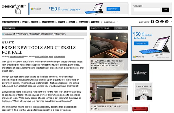
Remember that the MAIN purpose of the blog page is to have someone read your content. That’s it. Pop-ups, ads, and distracting links can actually frustrate your reader and cause them to go somewhere else. Take this example, where ads and other articles take up 50% of the screen:
When designing your blog, white space is your best friend. Keep some empty spaces and the entire page will feel much cleaner and easier to read.
5. Confusing navigation
A huge portion of your blog readers will find a specific article from a Google Search and click directly into the content. But that doesn’t mean you shouldn’t make it easy for them to discover content on other relevant topics, too.
Readers are likely to abandon your site if they can’t find content on topics they’re interested in. A search function and topic labels go a long way in making your content accessible and discoverable.
If you think there’s something else a reader needs to know after reading a particular article, consider adding links to related articles somewhere on the page. Just be sure it’s not distracting from your main point.
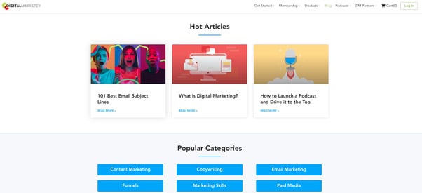
You should always have a clean, functional blog listing page that displays multiple articles at once. The layout is really up to you, but make sure that each article has an individual title, description, and photo. Listing pages are most commonly organized by publishing date or by topic.
(Psst: Are you a HubSpot user? They recently launched a new feature so you can edit your blog listing page like any other HubSpot page. Check it out!)
6. Boring, unengaging layout
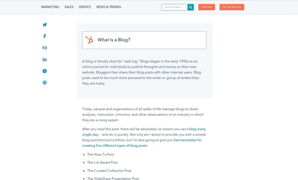
Nobody wants to read a blog that’s just a block of text on a plain white background. Keep readers interested by incorporating different design elements into your text.
Use a large, attention-grabbing photo for the featured image. Whenever possible, insert relevant pictures into the text to break up your sections and paragraphs. They’re a great way to separate content and add a bit of color and context.
You can also encourage your readers to engage with your post by adding a comments section or social sharing buttons.
7. Lack of CTAs
All of the above points will help your blog post function as a sales tool, since they provide a better, customer-first experience. But there’s one crucial blunder that we consider the worst of all: not including a CTA.
Use relevant CTAs throughout your post (and especially in the conclusion) to encourage readers to take the action you want next. This could be as simple as reading another blog, or directly encouraging them to make a purchase or book a sales call. Your CTA should make sense for the audience’s familiarity with your brand and be very clear on what you want them to do.
Whatever the CTA, design them to be clear and attention-grabbing. A different colored button or a link with a larger text size are two great examples of CTAs.
Is it time to redesign your blog?
Are you making any of these blunders on your blog? We’d love for you to take a deep dive and let us know what you find out.
If you need help with your blogging strategy, designing a template, or editing your existing blog, Horseshoe can help! Our CMS Design team has worked with dozens of companies to create beautiful, powerful blogs and website pages.
Find out more: https://www.horseshoeco.com/hubspot-cms