Over 100 billion emails are sent every single day. So the stakes are high to make a meaningful impression in your potential customers' inbox. You've already gotten their email address (yay!) so why blow your opportunity with lacklustre emails? When executed effectively, emails can turn your warm leads into paying customers and even brand evangelists! So before you hit send on your next email, print out this checklist to make sure your message is as awesome as you are.
Different Emails for Different Folks
One of the biggest advantages to email marketing is that you can personalize your message as much as you'd like. Your email will land in the recipient's inbox with a special message just for them. So while it's a lot easier to send one big email to your database, you're missing out on an opportunity to connect with each recipient.
 Source: https://i0.wp.com/blog.envisialearning.com/wp-content/uploads/2012/01/Unknown.jpeg
Your database is probably made up of all different types of leads with completely unique goals, so why send them the same message? Here are 3 dead giveaways that tell your contacts that you didn't take the time to segment your emails:
- Your email includes something like "Whether you're in situation ABC or DEF or GHI". If you've done your research correctly, you know exactly who your contacts are and what they're looking for
- Your greeting is generic: "Hi friend!", "Hi there!"
- The content is only relevant to some people
Take the extra hour to create 2-3 separate emails for the different types of leads in your email list. It'll go a long way!
Don't Forget Personalization
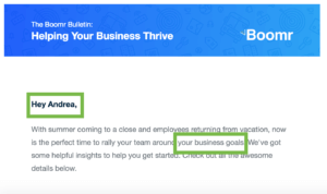
Even if you're sending different versions of your email, incorporating personalization just makes sense. Your email marketing software should include personalization functions. Greeting your recipient by name, referencing specific products or services the recipient looked at, or talking about an event that's near the contact's location are great ways to add a customized touch to your emails that your recipients will pick up on and establish feelings of trust in your company.

Guide Users to a Landing Page
Do you read every one of your emails word-for-word? Probably not. Most people tend to skim emails looking for bold words that stand out, buttons, and links. If your email links back to your homepage or another generic site where recipients will have to go looking for the offer you're sharing, they'll likely bounce. Make it simple by driving your users to a landing page where you can control the content. You can choose to:
- Eliminate the navigation to keep users focused
- Include a form that will help you learn more about your contacts
- Match the copy in your email (to keep it consistent)
If the goal of your email is to keep your leads engaged with your brand, guiding them to a landing page is a great way to achieve this.
Test in Different Browsers/Devices
Sending a test version of your email to yourself and reviewing for typos just won't cut it anymore. With so many different browsers and devices, you need to ensure your email looks perfect on all of them. Words that are cut off, images that aren't displaying, or buttons that aren't styled all contribute to a poor user experience. And whether we acknowledge it or not, a poor user experience looms very heavily on brand perception. There are direct links between negative brand perception and decreased engagement and even revenue.
[Subtly] Include Your Logo
It's frustrating when you receive emails and have no idea who they're from. If a contact opens your email but draws a blank on who the sender is, and the email shows no indication, you'll typically see a large number of unsubscribes. Your recipients will feel puzzled as to how you got their email address and may even flag your message as spam! Whether you modify your sender name to be your company name, "Your Name from Company ABC" or include a small logo in your email template, be sure to make it clear who you are.
Communicate the Next Step with a CTA
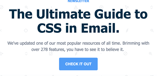
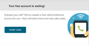
People often need to be guided towards where they’re supposed to click next with a call-to-action (CTA). This is especially true in emails when people tend to skim rather than read word-for-word. Show your contacts what they should do next. Is it to register for an event? Learn more? Include a button or link in your email communicating what the next step is. If you can't think of a strong CTA, consider the underlying goal of the email in general. Here are a few examples:

Looking to become a better email marketer? Join our list to get tips right in your inbox.


