You loved your logo at first. You were excited to show it off to the world. But as you come across other cool and unique business's logos, you're realizing how awful your logo design really is. But it doesn't need to be! A logo refresh can actually be a great opportunity to attract new business if you promote it in the right places. Here are 5 reasons your logo isn't doing its job:
It looks awful on a coloured background
This is a big pet peeve of mine and it's usually a result of a DIY logo created by someone without a design background. If you're not familiar with that I'm talking about, this is when you see a logo with a coloured background that's placed on another colour. I've created an example using my own logo to demonstrate.
People don't know what your business does
When people don't understand what you do after seeing your logo, it can be a combined result of an ambiguous business name and unclear logo. You shouldn't leave people guessing. If there were no words in your logo, would people still be able to identify what you sell?
Your logo design is outdated
I'm not sure if there's anything worse than a logo that uses the Papyrus font. Logos are more or less subjective and what speaks to you and your customers may not be a fit for other businesses, but there are some concepts and elements that are just totally outdated. I've rounded up a few examples of logos that are definitely stuck in the past.
![]()
![]()
![]()
It's not really a logo at all
When businesses decide to DIY their own logo, they sometimes skip an important step: creating a logo! When prompted to place a logo on say, a website or business card, platforms like Vistaprint or Wix allow you to "design a logo" by simply typing their business name into the placeholder, choosing a font, and BOOM: a logo is born. But what's memorable about that? Your logo should be interesting and allow customer's to establish a connection with your business.
![]()
No one can read it
Whether it's the font selection, typeface size, or colour, reading what your logo says should be one of the most primary goals of the image. If you see people squinting or taking a step back (or worse--asking you what the logo says!), you could be losing out on business.
![]()
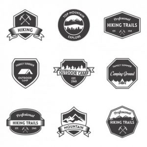
It's generic
Free tools like Canva have made it easy for non-designers to slap together logos. Except now, everyone's logo looks the same! Ask a stranger to do the squint test. If they squint and look at your logo from a far, is it clear that it's yours? Or could it be confused for a similar logo?
You can't stand it
This is the ultimate red flag that it's time for a logo design refresh. How do you plan to wear your brand with pride when you're secretly seething about your logo? It's time to upgrade to a design you'll feel confident in.
Looking for some direction on creating a logo that speaks volumes about your business and catches your customer's eye? Let's chat!